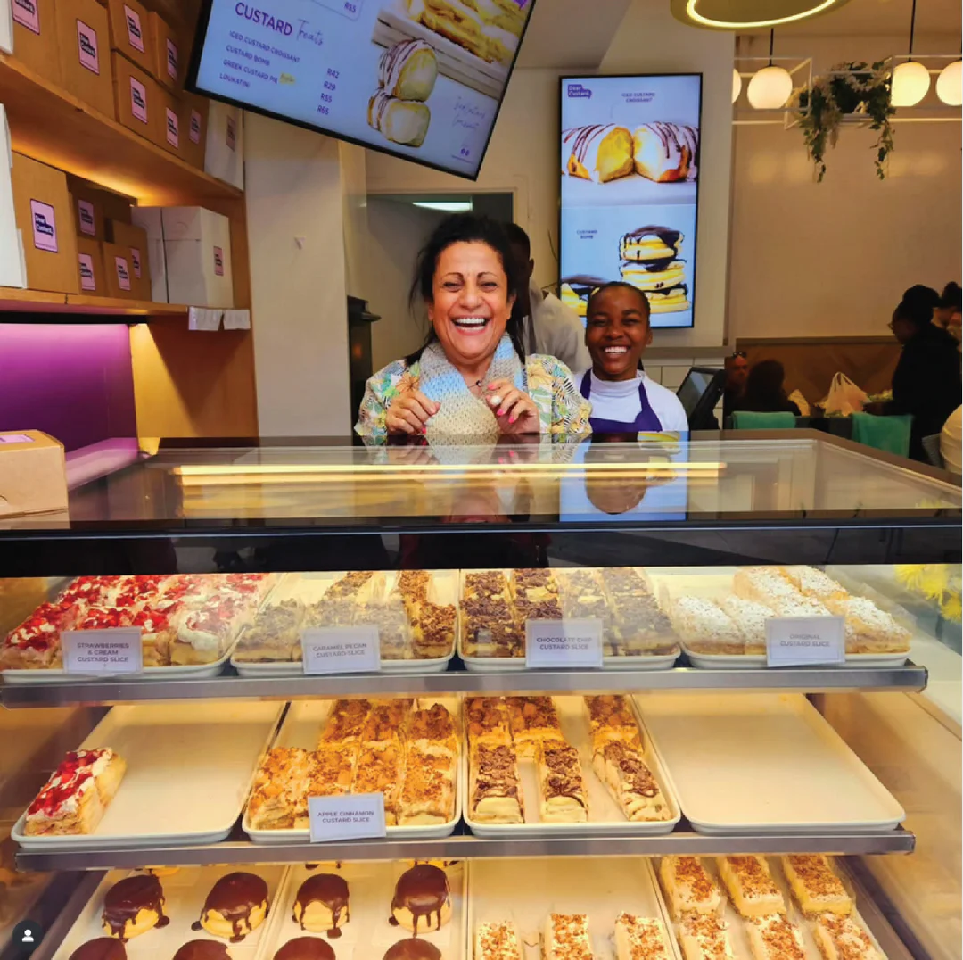
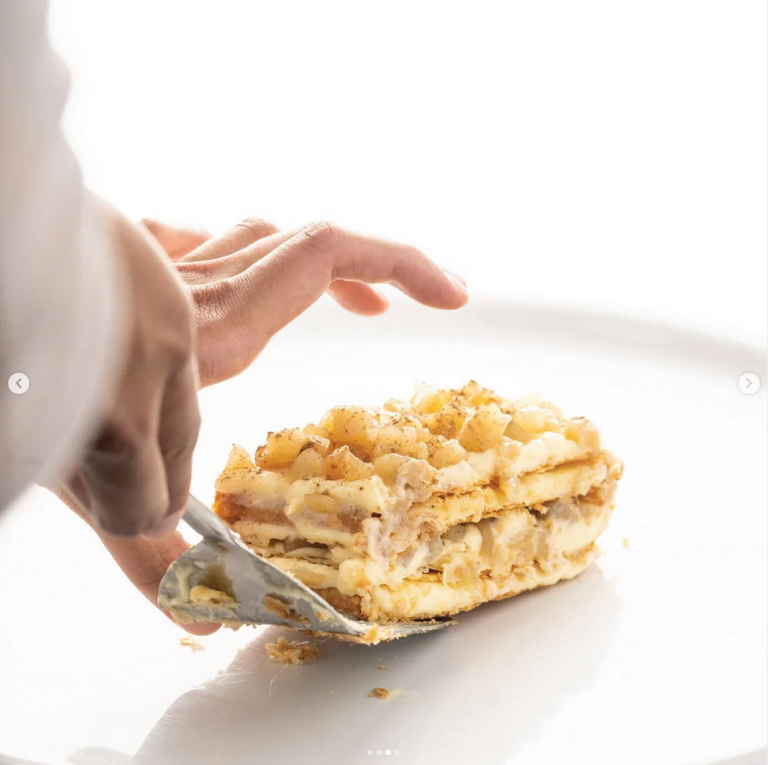
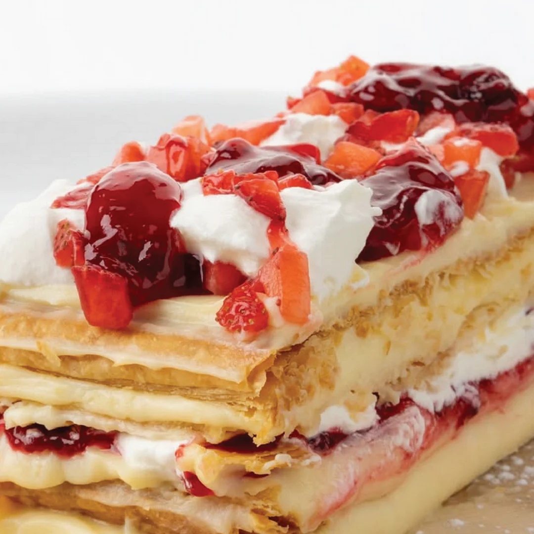
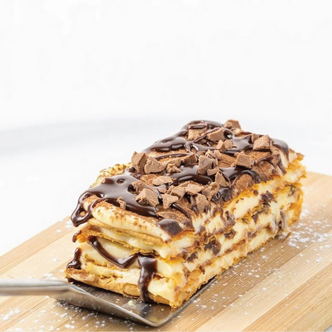
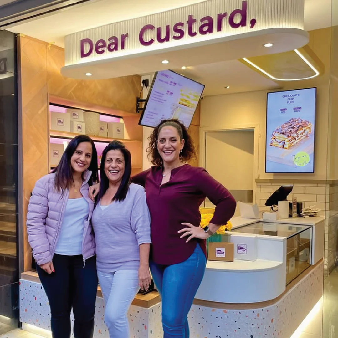
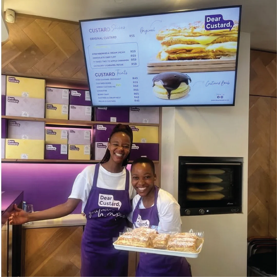
A basic visual brand identity. A top selling treat for 24 years branches out with a new and creative concept and life. After being the side character for too long, it was time for custard to reinvent itself as the star of the show.
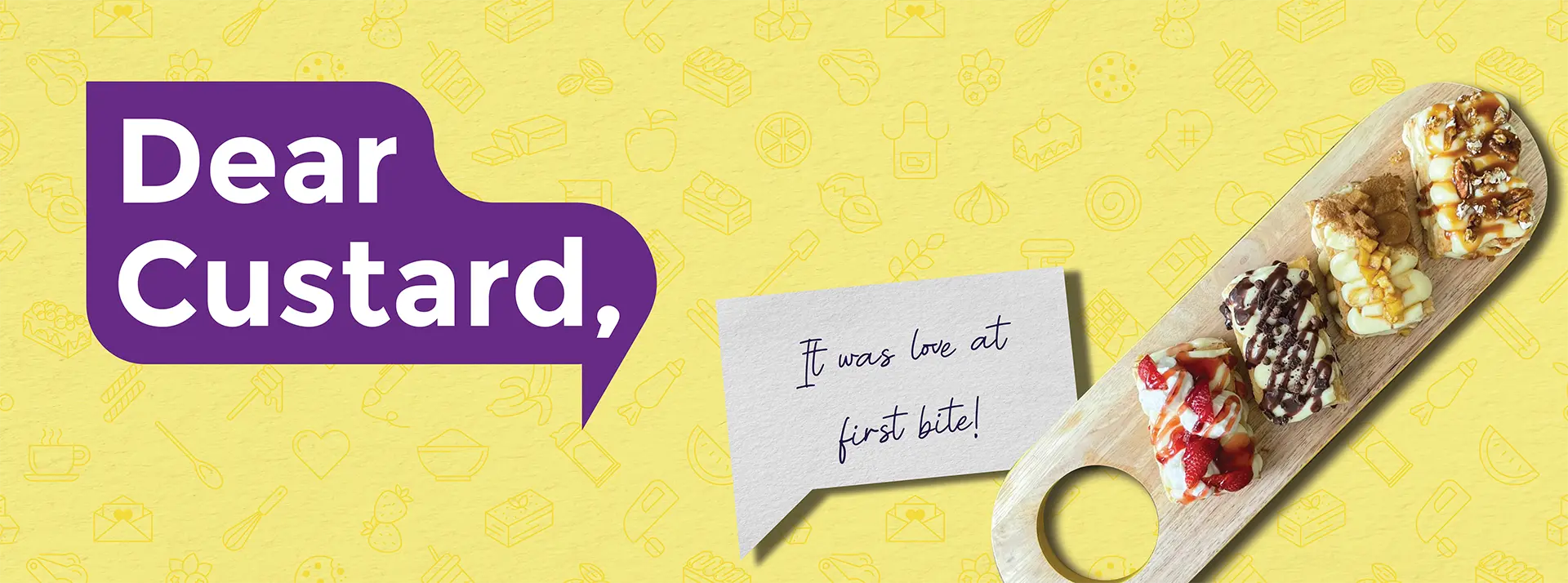
The name “Dear Custard” was based on the concept of custard being more than just a sweet condiment, more than just a side dish of dessert. Custard is a warm and familiar friend, one that we want to have loving and meaningful conversations with. But how do you talk to custard? By
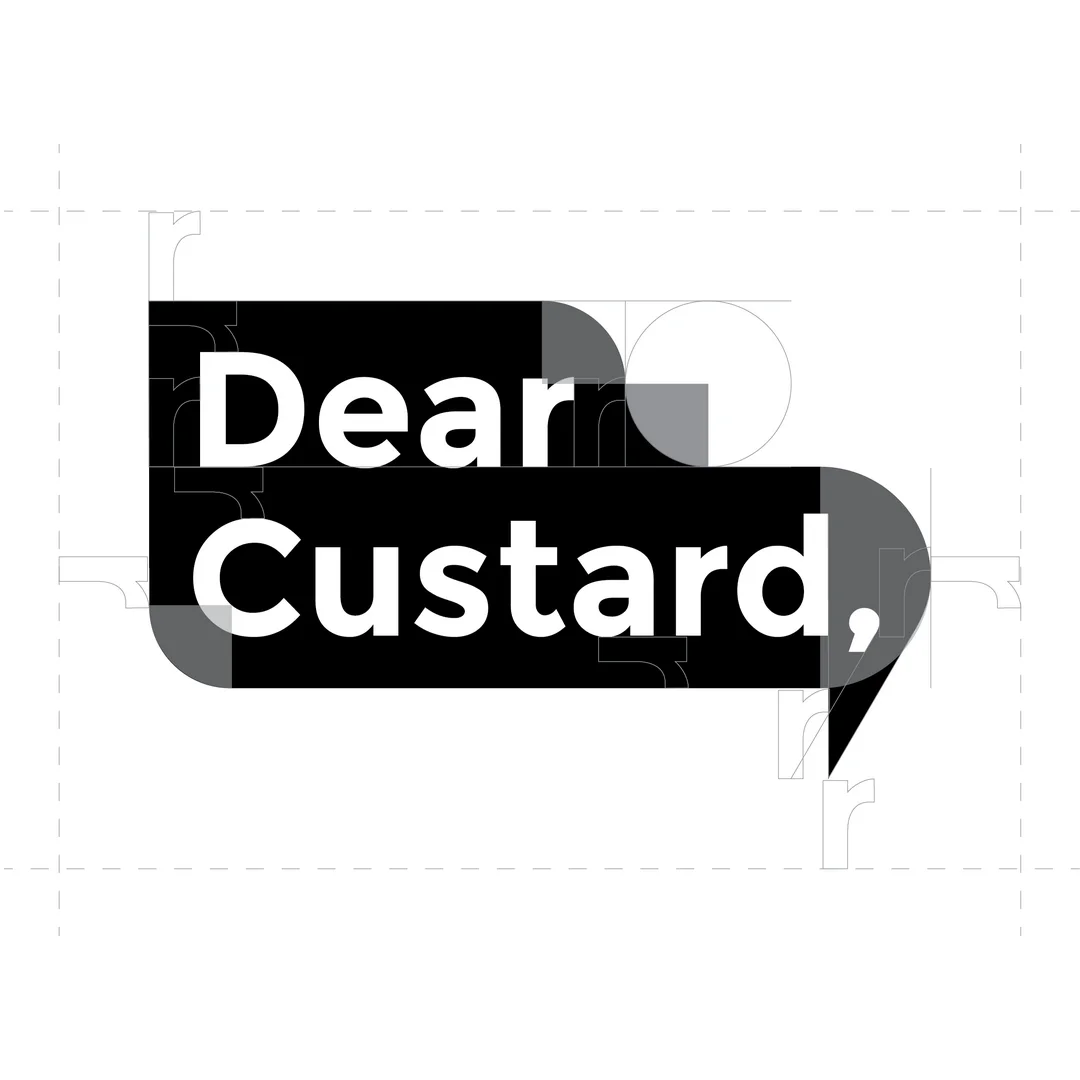
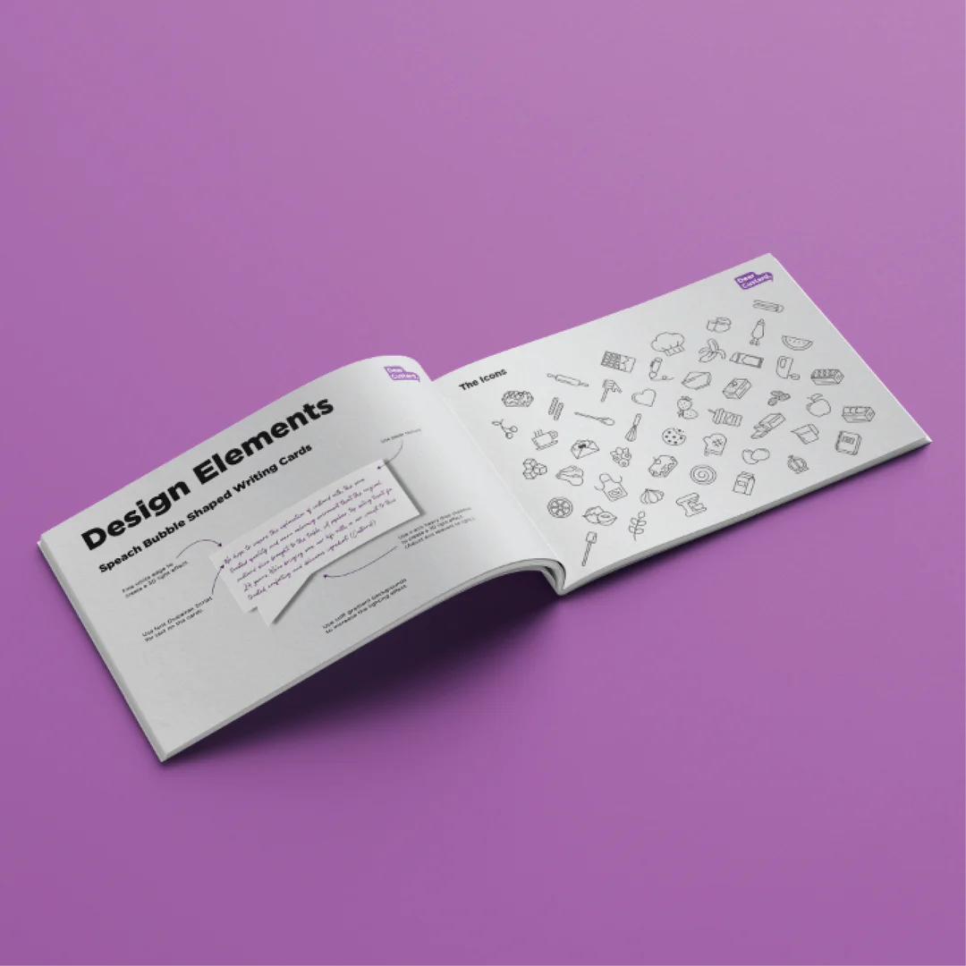
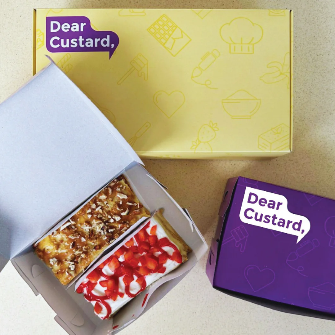
writing a letter, a note, a message. The logo needed to be youthful and fun while capturing the essence of a conversation, and the beginning of a story. The shape of the logo symbolizes a speech bubble, as well as the fluid and rippling beauty of custards’ texture. Geometrically balanced and aligned creating unifying liquid-like flow. The comma at the end of the name signifies continuation and more to come,
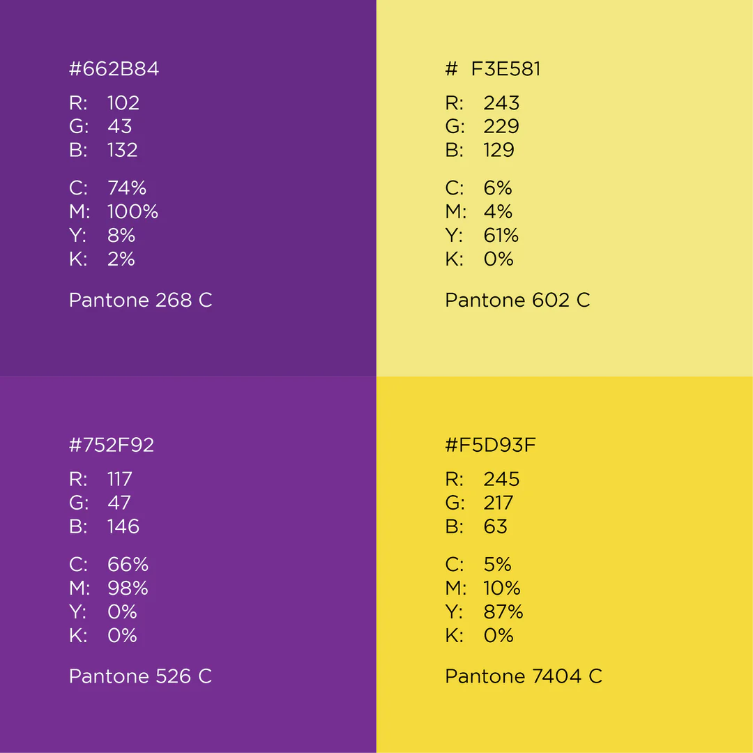
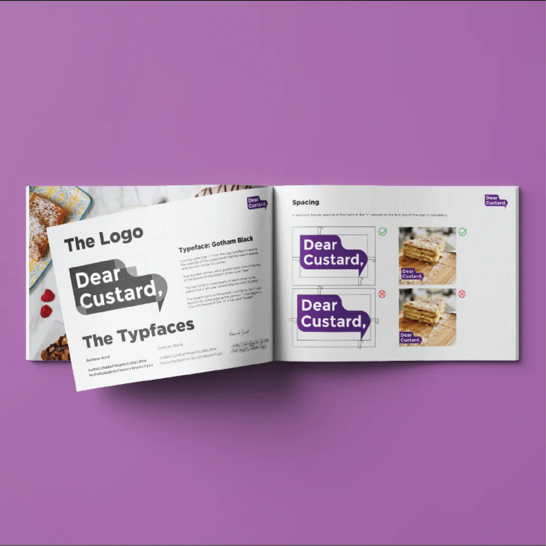
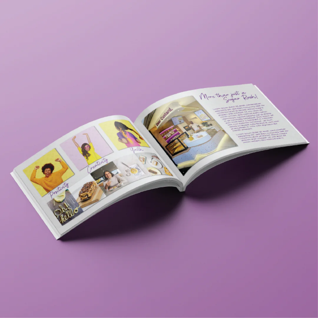
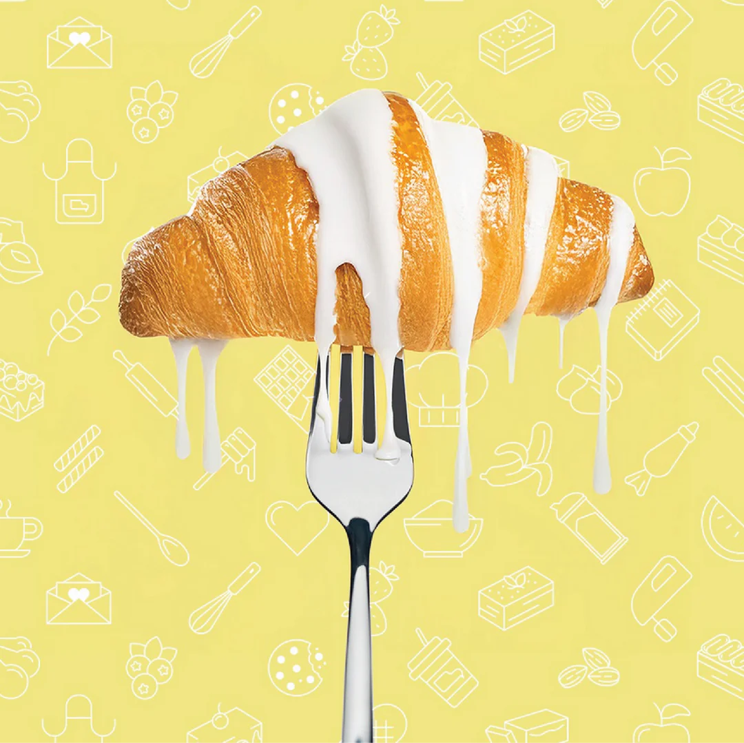
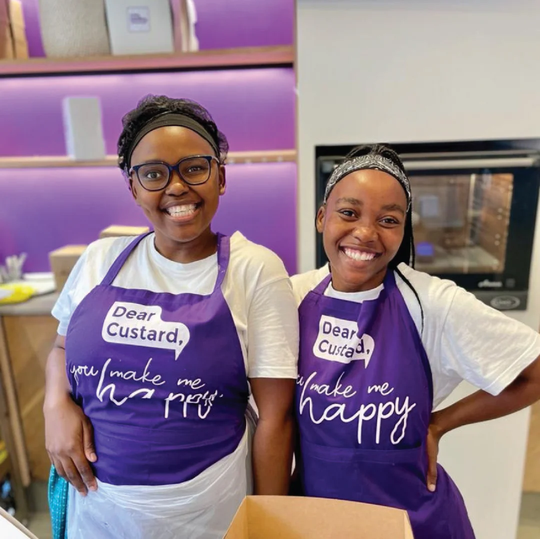
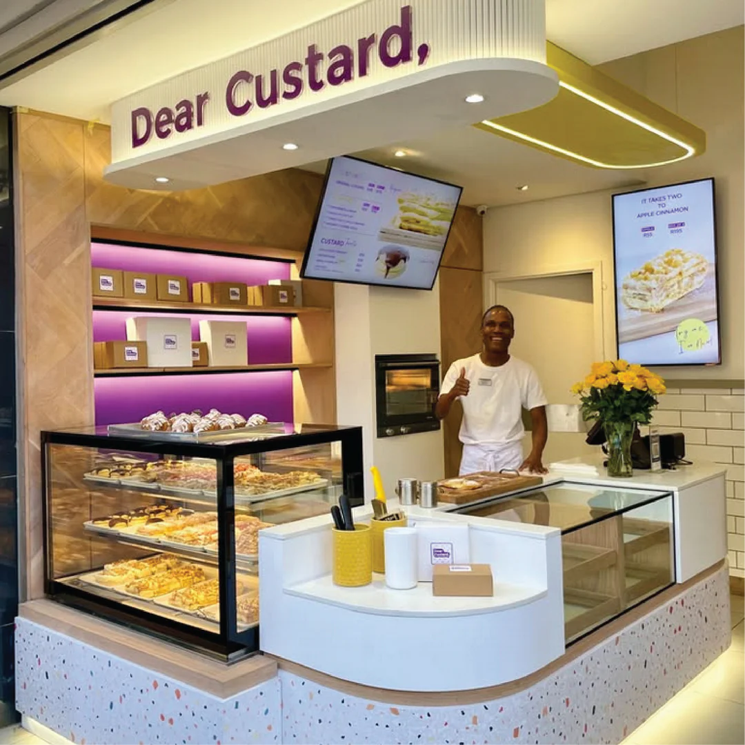
The brief was simple: Make it fun, youthful, creative and original – Make it like Custard! Colours were chosen based on these fundementals and original icons were each created to show off the limitless ingredients that went hand in hand with custard so well, the various creative methods of cooking with custard, and the conversation between us and custard. A corporate identity was created to keep the visual consistency throughout the brand.