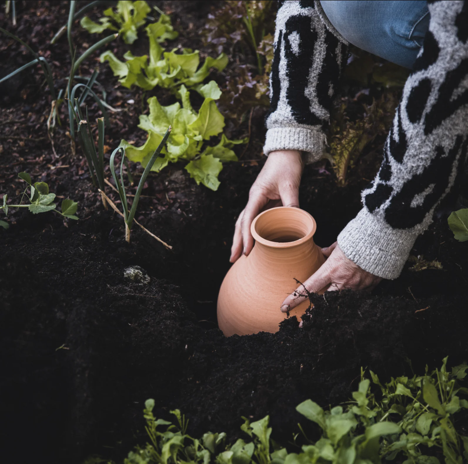
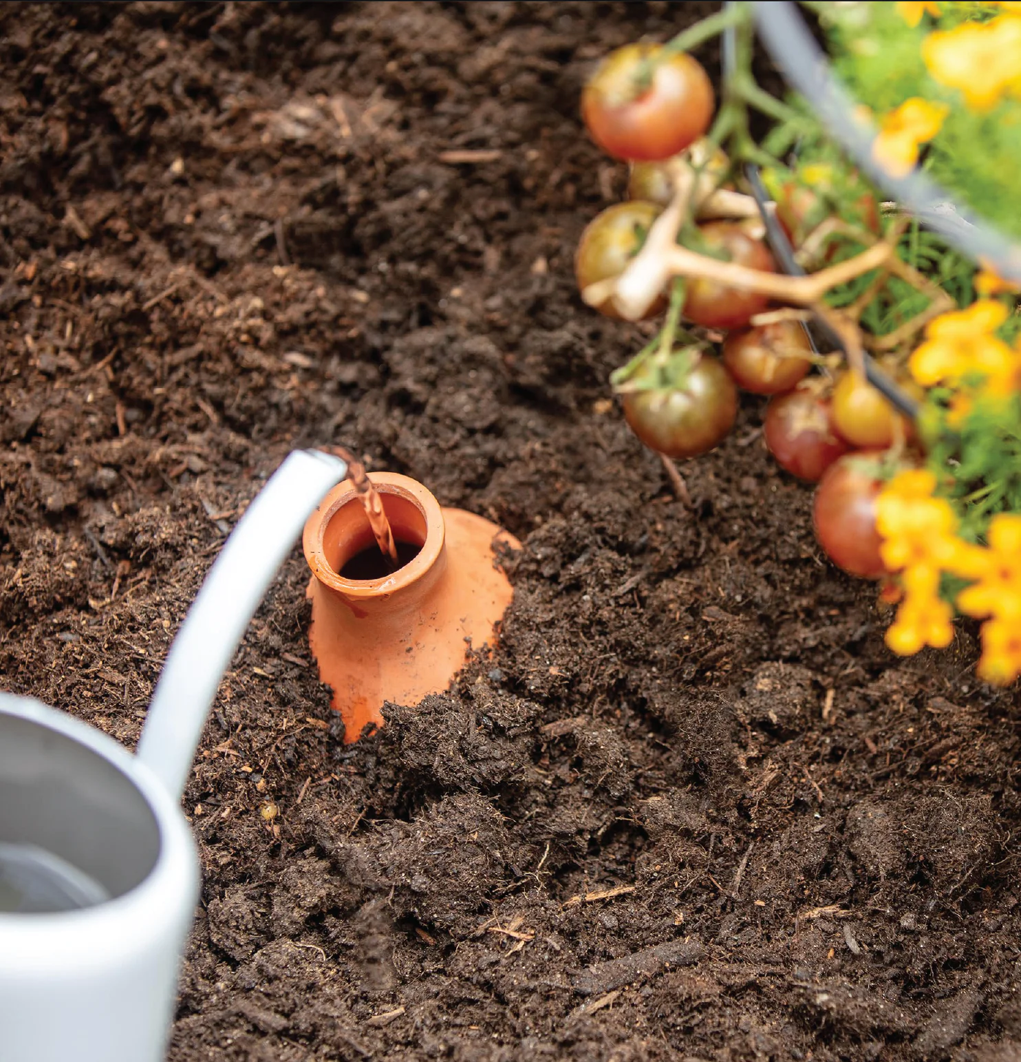
An innovative South African farmer that made use of an ancient irrigation method decided to turn this product into it’s very own brand for the modern home gardener to save them time, money, effort and water.
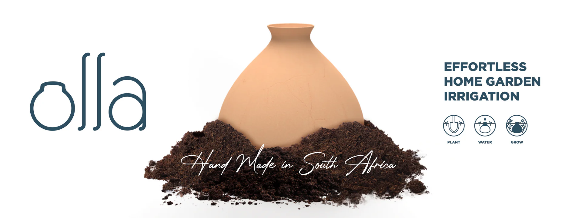
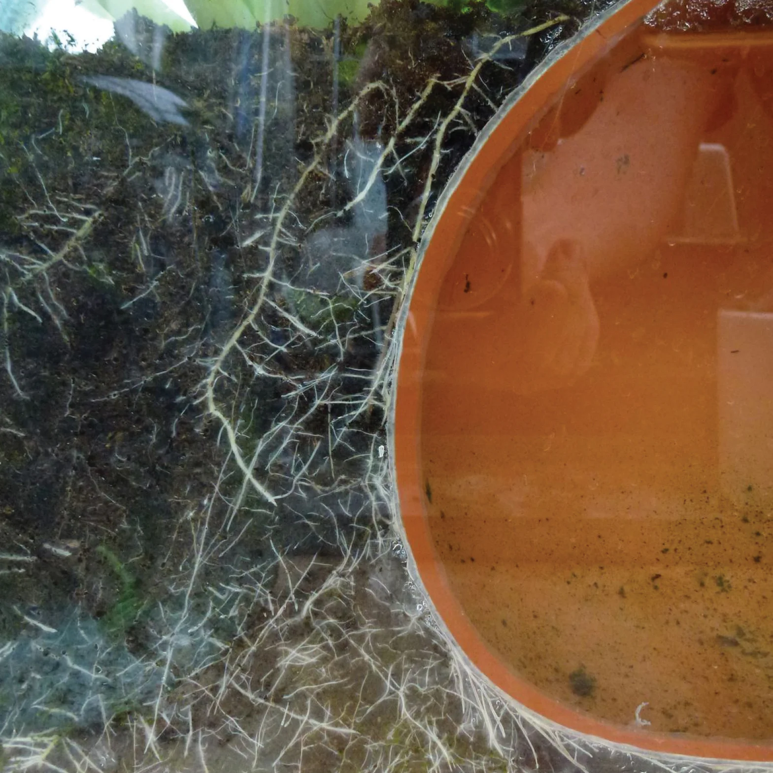
Understanding how the olla works and keeping in mind how beautifully simplistic this ancient irrigation system is, the logo was designed in kind. The “O” of the olla is shaped as the product itself and the following letters “L, L, A” interact with the “O” olla the same way that plants interact with the real thing. When using an olla to water your plants, the unvarnished clay creates a slow release of water into the soil. Roots of plants are drawn closer and closer to the olla as it’s source of water. Over time, the roots may even completely circle and encapsulate the olla as it releases water into the soil at a slow and steady pace. The “roots” of the letters all turn and face the “O” olla to represent and mimic this magical process.
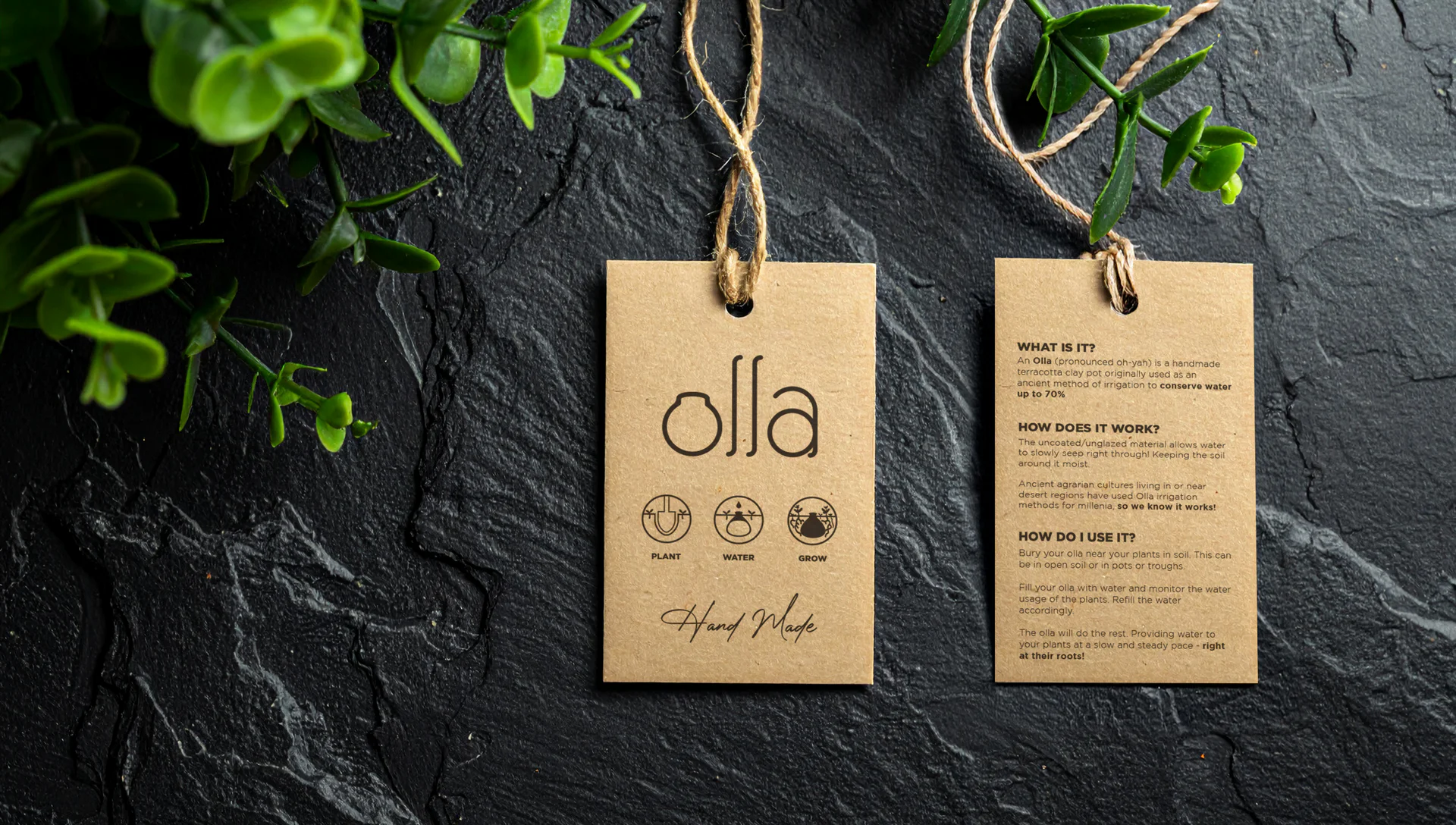
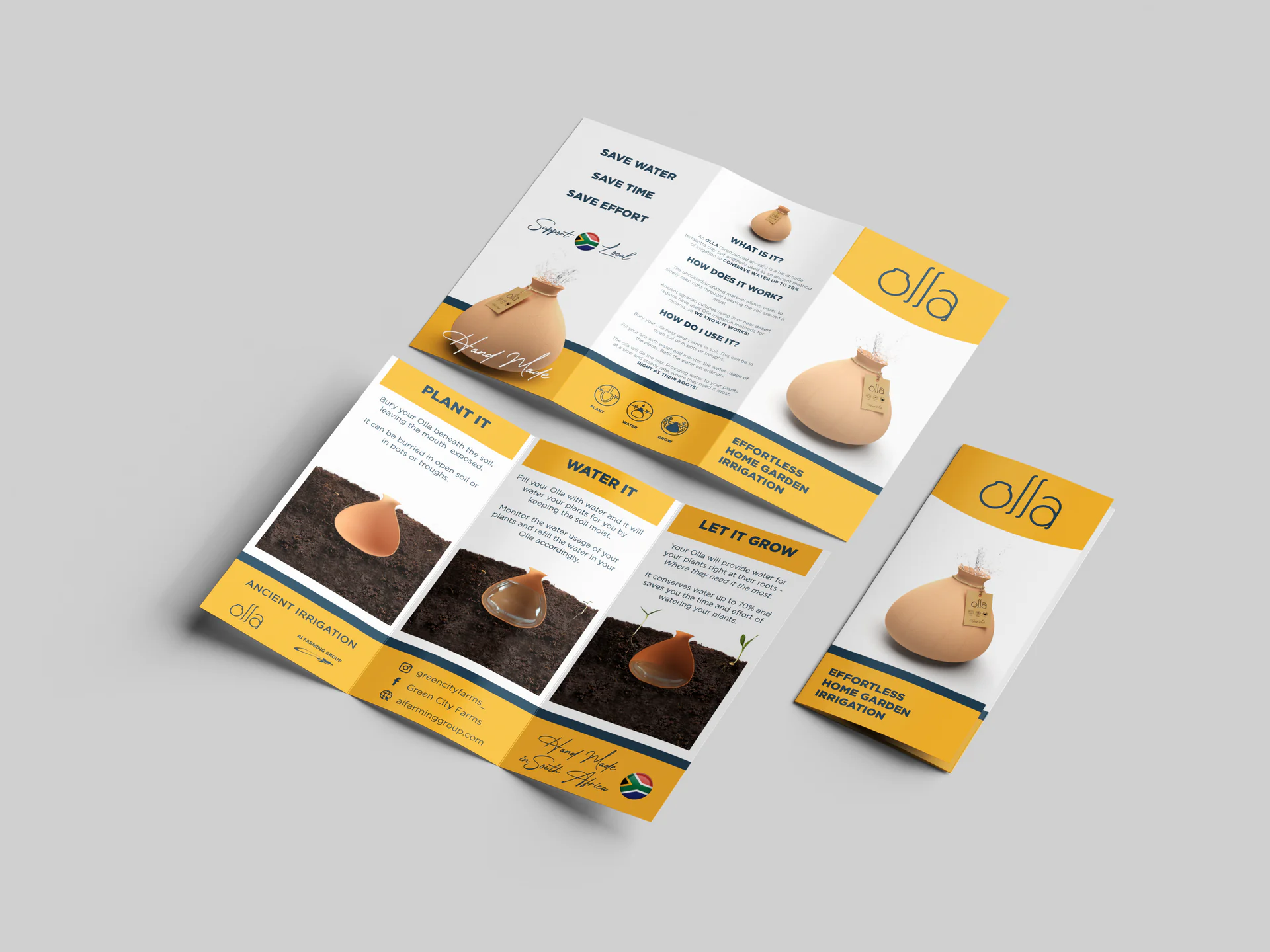
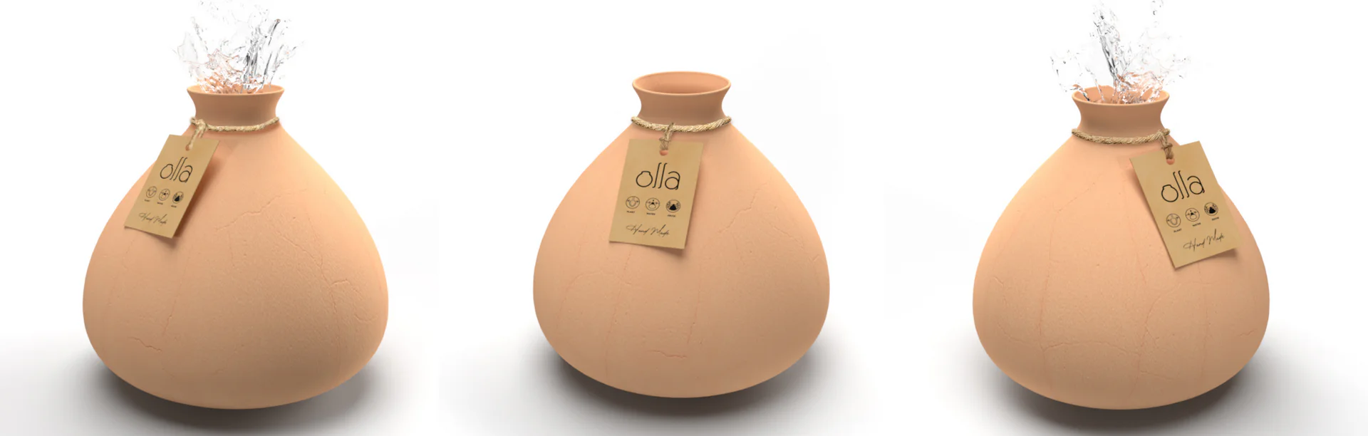
The logo is complete and the product has been around for 4000+ years. The next step was to brand the product, provide sufficient information and instructions and add little bit of marketing magic. To keep it simple and eco-friendly, we designed a seed paper tag to be tied around the neck with string that answered the basic questions of what this adorable little clay pot was, how it worked and how to use it. The choice of marketing was a few launcher instagram story posts for his farming page and a tri-fold flyer.