The pharmaceutical cosmetics company that’s all about bringing healing energy to medicinal ointments and cosmetic creams since 1999.
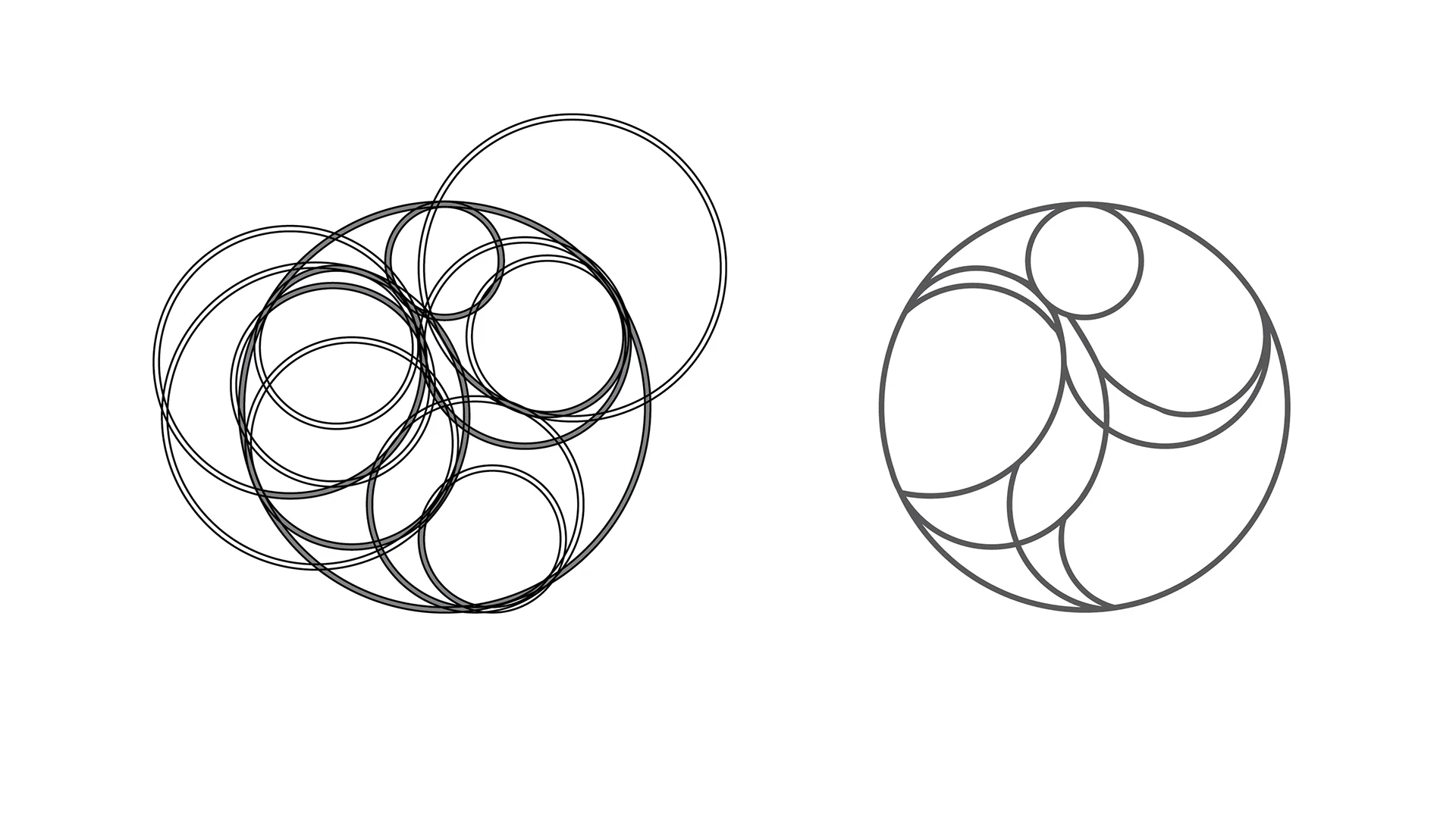

Ché’s logo was briefed to be a will-o’-the-wisp: a folklore spirit or fairy known to guide travelers by resembling a flickering light revealing a path or direction. They are usually portrayed as dancing or flowing. The wisp icon was created purely using circles. Circular shapes evoke feelings of harmony, comfort, eternity and unity. This encapsulates the brands value of healing energy and perfectly resembles the will-o’-the-wisp’s dancing and flowing movement.
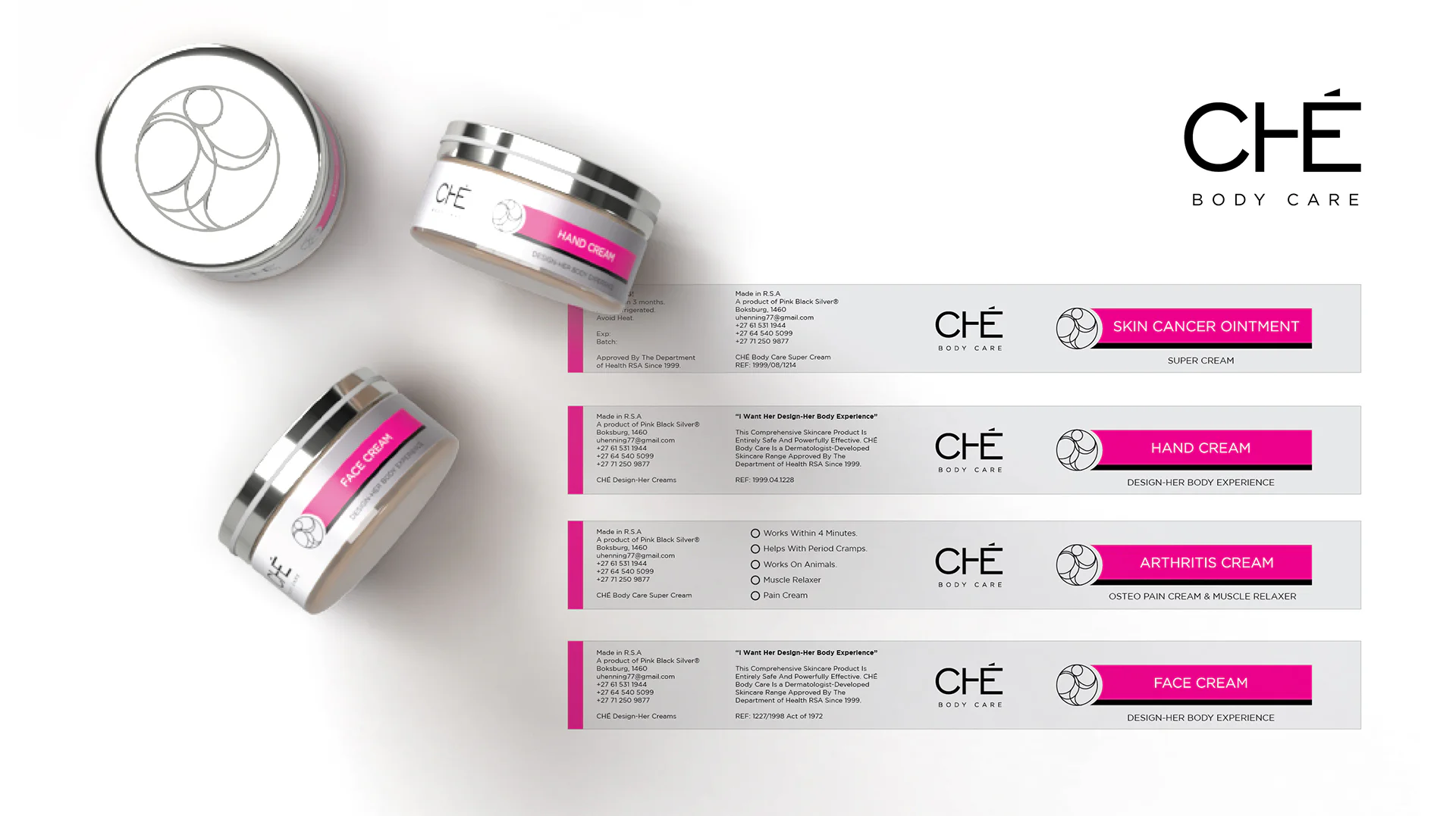
Ché’s was aiming for a sleek and modern identity and their new color palette was insisted to be pink, black and silver while maintaining a unisex target audience. While pink is tightly connected to feminine brands and products, the challenge was accepted. With a primarily silver palette, black provides a strong contrast for the text and brand elements. An electric magenta pink was chosen as an accent to brighten and liven up the aesthetic. Exploring the dual nature of pink, blends red’s energy with white’s softness, evoking youth and luxury. The perfect emotional balance for cosmetic and dermatology products.
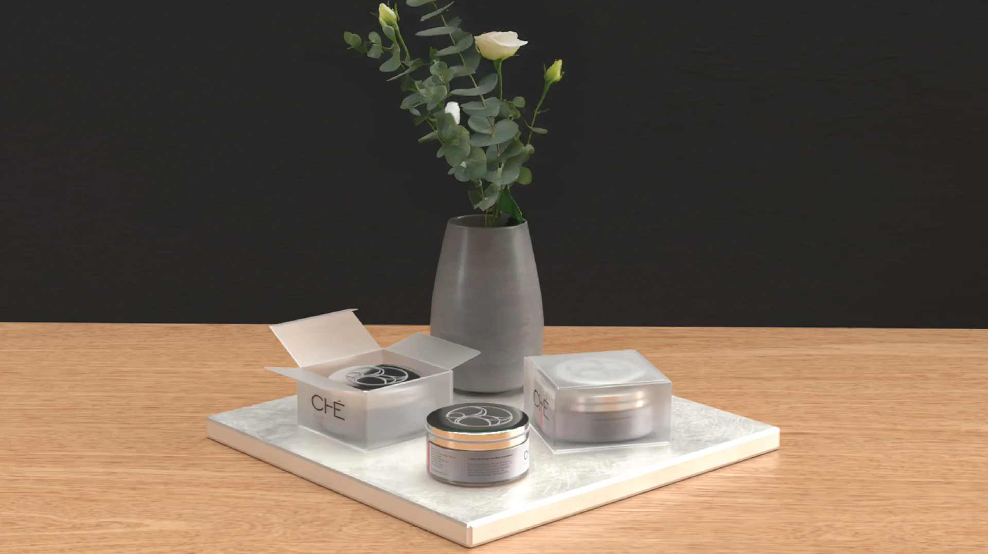
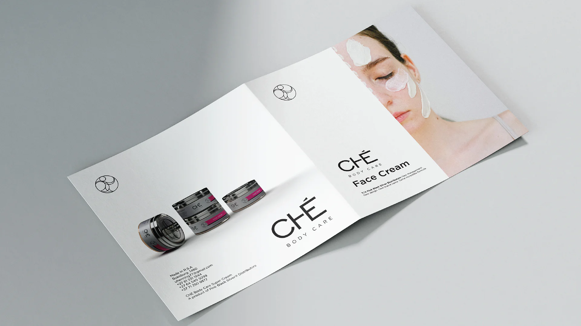
A simple and elegant glass jar with a smooth and shiny silver lid was decided as the bottle of choice. A subtle matted silver vinyl was chosen for the material the labels were printed on, along with a thin strip wrapped perfectly around the lid. This not only functioned as an extra design element but added a lightly matted grip to the lid, making it easier to open. Finally, the same material was used to cut out the logo and be placed on top of the circular lid, perfectly centered. The matte silver against the shiny silver gave this design an extra element of luxury and awe, and ensured the branding can be viewed from every direction of the bottle.
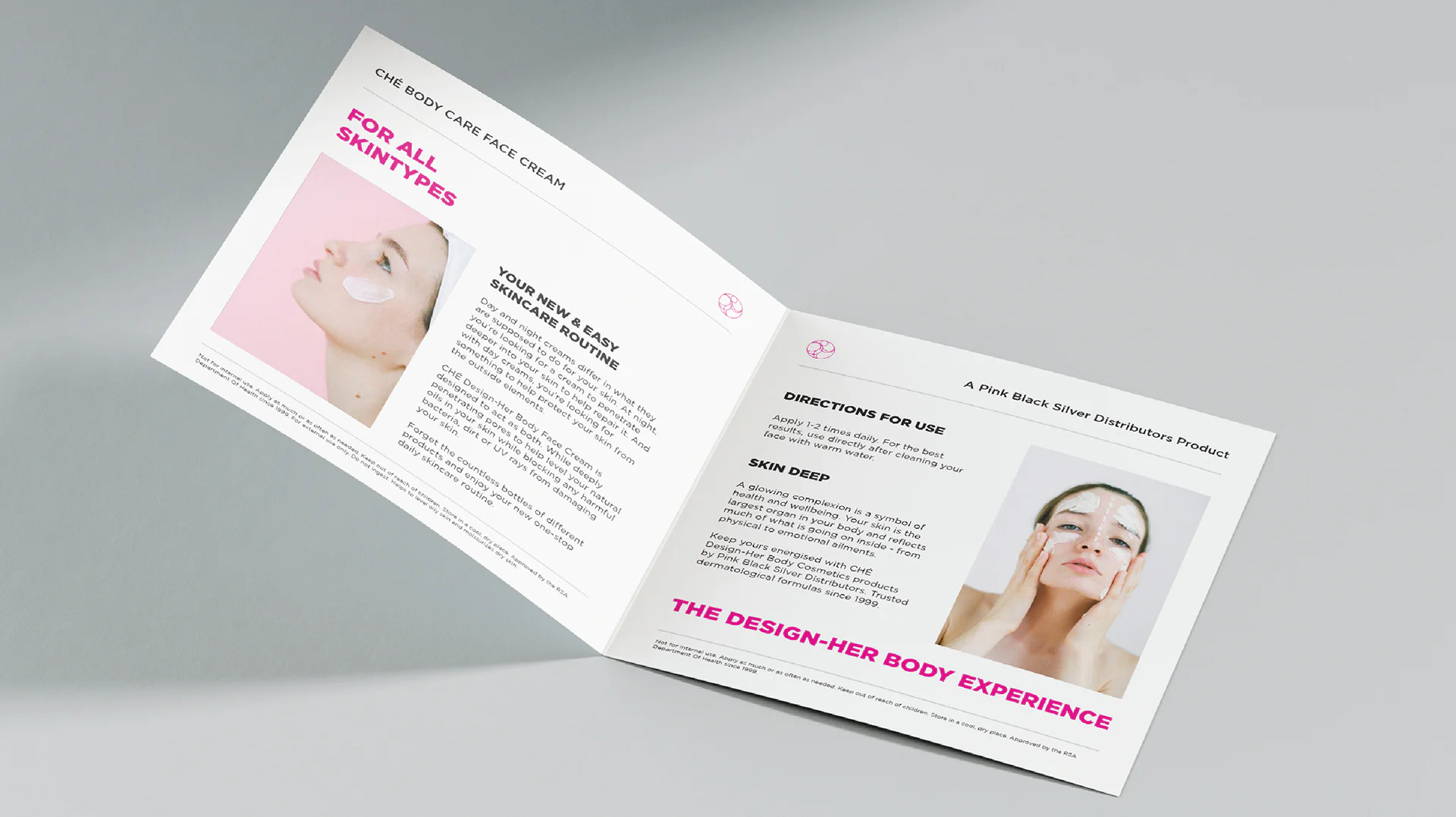
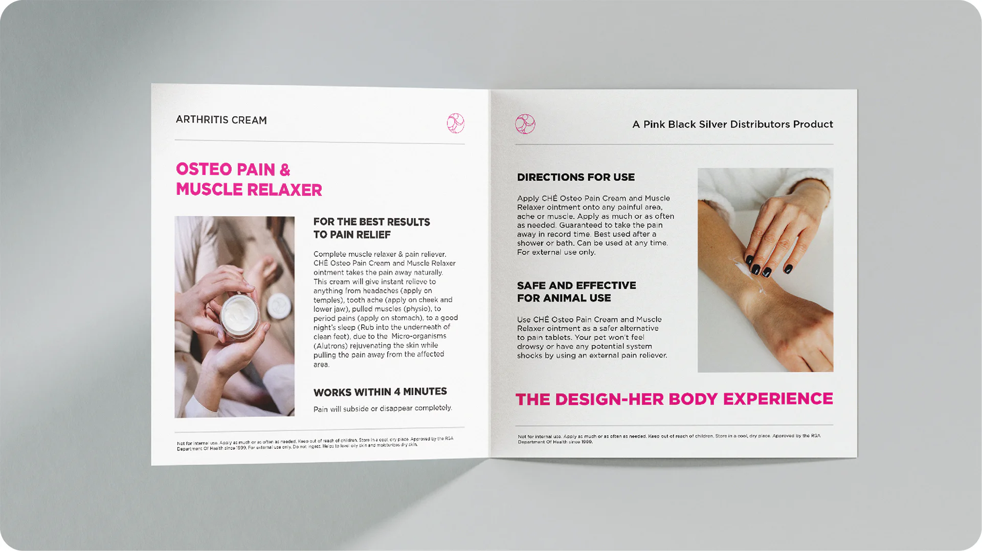
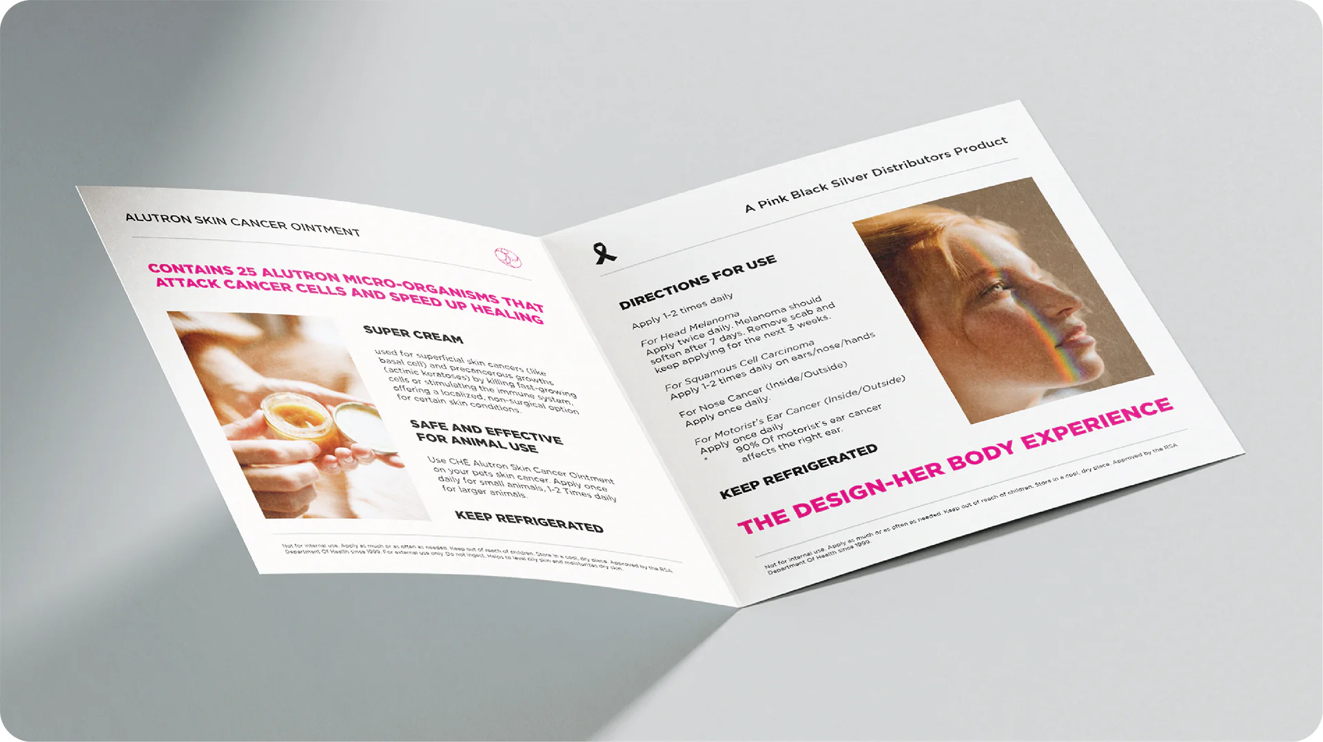
The bottles were placed on top of a square pamphlet each respective to their own product which was then placed in a grainy, slightly transparent plastic box. This added to the unboxing experience of the product, taking it even further as a luxury product. The product was slightly visible from the outside, blurred by the grainy texture of the vacuum sealed box which added intrigue and mystery to potential buyers. The product needed to be purchased and unboxed in order for you to see the whole picture.
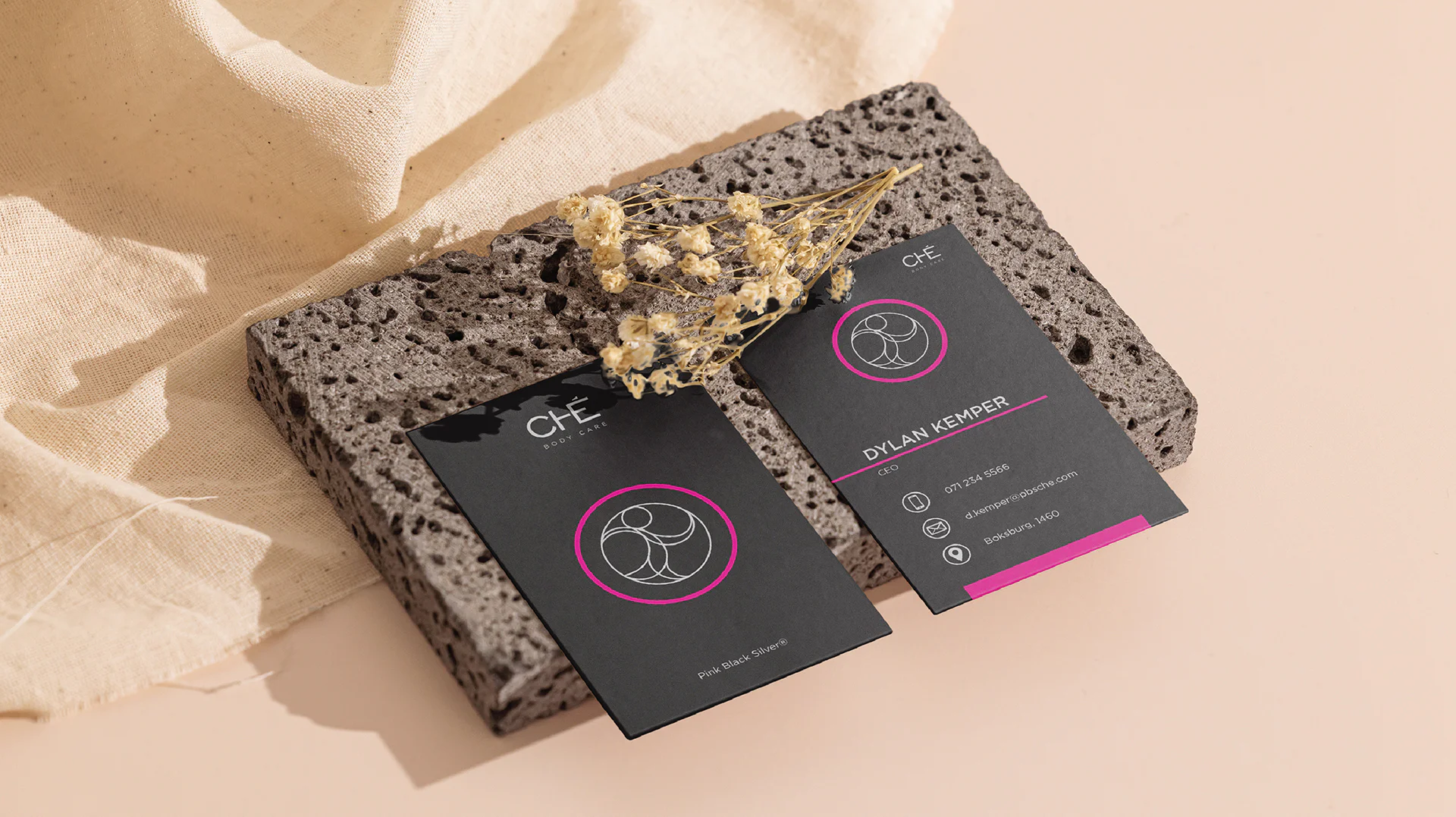
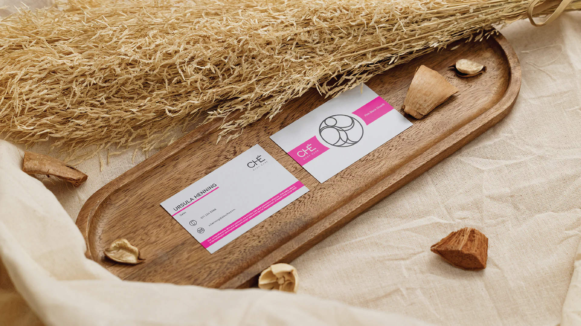
Both design options were approved for Ché’s business cards. While the CEO and upper management would take the sleek and dark portrait layout cards, the sales representatives were to have silver, landscape cards instead. This was the approved solution to not being able to decide which design was better. Ché wanted both!